Andy Jones
Visualizing differential equations in Python
In this post, we try to visualize a couple simple differential equations and their solutions with a few lines of Python code.
Setup
Consider the following simple differential equation
\begin{equation} \frac{dy}{dx} = x. \label{diffeq1} \end{equation}
Clearly, the solution to this equation will have the form
\[y = \frac12 x^2 + C\]where $C \in \mathbb{R}$ is any constant.
There are two ways we can think about the differential equation in \eqref{diffeq1}.
Integral curves
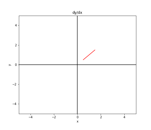
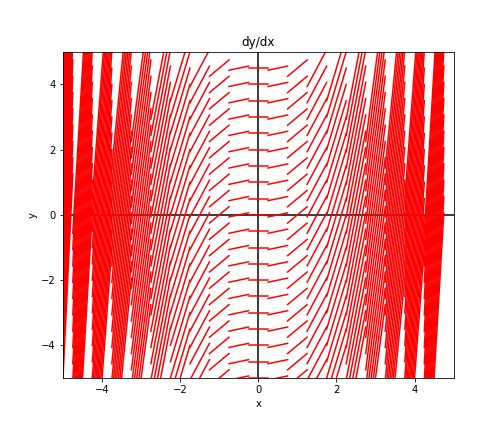
First, we can say that for a given point $(x_0, y_0)$, the equation computes the slope $m$ of the tangent line at that point as $m = x$.
For example, consider the point $(1, 1)$. Clearly, at this point $\frac{dy}{dx} = 1$. We can visualize this by plotting a small line with slope $1$ at the point $(1, 1)$.
We can plot another line at $(2, 1)$.
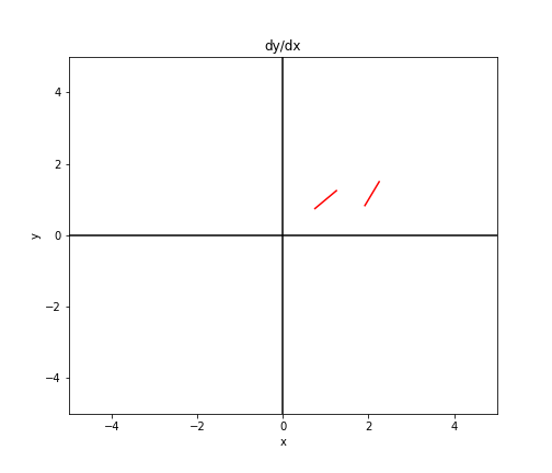
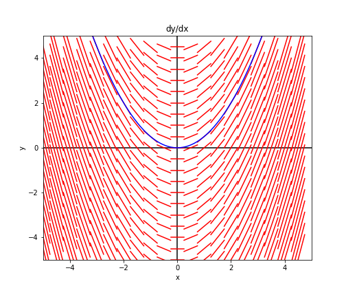
We can continue doing this at points throughout the graph to get a sense of what the vector field looks like.
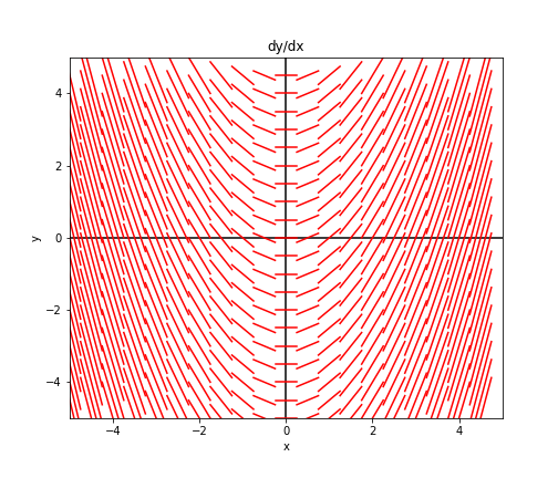
As expected, the graph has a parabolic shape to it, as we saw from the solution to Equation \eqref{diffeq1}. Also notice that we can trace any single one of these curves to yield a single solution.
Consider a slightly different example:
\[\frac{dy}{dx} = x + y.\]We can plot similar lines for this equation and notice a different pattern, this time having the shape of curves $x^3 + C$:
Isoclines
Here’s a second approach for visualizing differential equations and their solutions. For a given slope $m_0$, we can find all points ${(x, y)}$ that satisfy $\frac{dy}{dx} = m_0$. These points form a curve called an “isocline” (think iso = same, cline = change).
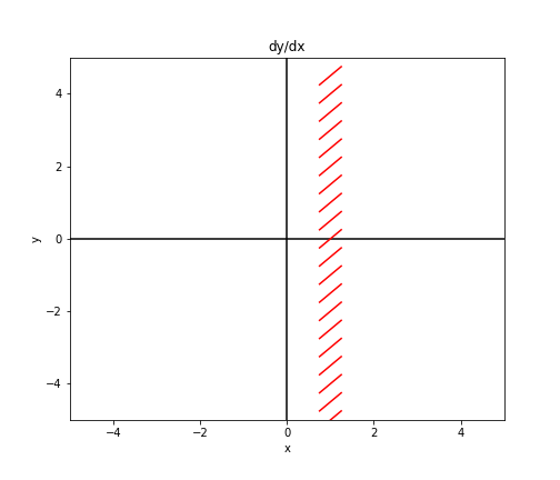
Consider again the example $\frac{dy}{dx} = x$. In this case, these points will lie along a verical line:
\[x = m_0.\]Notationally, we can write this as the set ${(x, y) : y = m_0 - x}$.
To start plotting this, consider $m_0 = 1$. That is, let’s find all the points where the slope is $1$. In this example, these points will lie along the line $x = 1$. Plotting this, we have the following graph.
We can continue this for various values of $m_0$ to fill out the same plot:
Code
Here’s the simple code used to visualize these equations. Simply fill in the body of the function dydx(x, y).
mesh_width = 0.5
dir_field_x_template = np.linspace(-mesh_width / 2, mesh_width / 2, 100)
xlims = [-5, 5]
ylims = [-5, 5]

def dydx(x, y):
    return x

plt.figure(figsize=(7, 6))
plt.xlim(xlims)
plt.ylim(ylims)
plt.axvline(0, c="black")
plt.axhline(0, c="black")

for x in np.arange(xlims[0], xlims[1], mesh_width):
    for y in np.arange(ylims[0], ylims[1], mesh_width):
        curr_slope = dydx(x, y)
        curr_intercept = y - curr_slope * x
        dir_field_xs = dir_field_x_template + x
        dir_field_ys = [curr_slope * dfx + curr_intercept for dfx in dir_field_xs]
        plt.plot(dir_field_xs, dir_field_ys, color="red")
plt.xlabel("x")
plt.ylabel("y")
plt.title("dy/dx")
plt.show()
References
- Prof. Arthur Mattuck’s Differential Equations lecture videos